A creative business professional with a
knack for graphic design

drawn to new tools and unfamiliar territory

Scroll to explore

BRANDING Project:

Most festival brands start with a name and build a visual system around it. HEIMWEE started the other way around - with an emotion. The Dutch word for homesickness, reframed as longing for a feeling rather than a place. The kind of nostalgia you feel for a moment while it's still happening.

Every design decision follows from that: the tension between sharp pixel typography and organic flowing shapes, between digital and summer, between now and before. The visual system doesn't illustrate the concept - it embodies it.

NOT A FESTIVAL. A FEELING.

The logo holds a deliberate contradiction. H E I and E E are set in a blocky pixel font - hard-edged, digital, precise. The M and W between them are one continuous organic wave - fluid, warm, analogue. Neither element works alone. Together they create the visual tension that defines the brand.

The system extends across three colour variants tied to the three festival days: green for discovery, pink for peak energy, and the dark purple main version for the full identity. Same mark, different feeling each time.

ONE MARK. TWO LANGUAGES.

Festival branding doesn't stop at the poster. It lives on every object a visitor touches: the wristband on their wrist, the token in their hand, the frisbee mid-air. For HEIMWEE, each of those objects needed to carry the same visual language without feeling like a logo slapped on a product.

Three textures do the heavy lifting. The wave grid: the Heimwee swirl repeated across a halftone field - gives every surface pattern and depth. The pixel structure from the logo typography brings the digital, nostalgic edge. And a glass-like overlay adds dreaminess - softening the edges, catching light, giving the impression of something half-remembered. Together they create POSM that feels designed from the inside out, not just printed on top.

BUILT TO BE TOUCHED.

A traditional brandbook is a PDF. You open it, you read it, you close it.
I wanted something people would pick up and not put down, something that created a feeling before anyone read a single word.

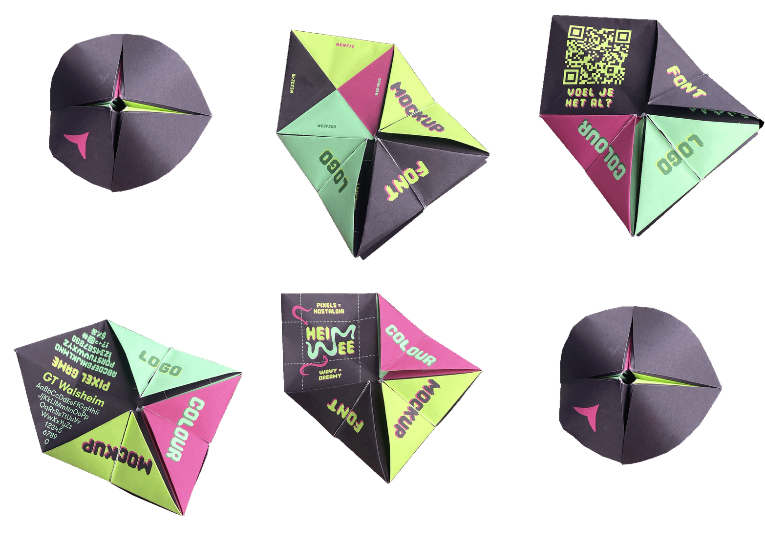
The entire Heimwee visual system: colour palette, logo variants, typography,
hex codes, is folded into a fortune teller. The format most people haven't touched since primary school. Unfold it and the brandbook reveals itself. Turn it over and the pink triangle on the back spins perfectly, becoming a spin-the-bottle by accident of shape. It exists as a proof of concept for the festival ticket, and as a reminder that the strongest brand moments don't live on screens.

THE BRANDBOOK YOU ALREADY KNOW HOW TO USE.

Logo Project:

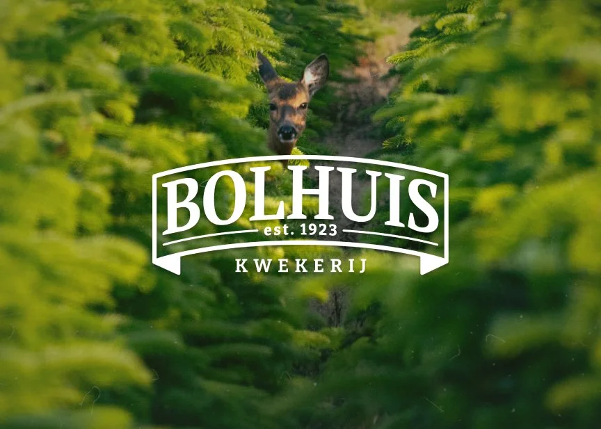
Since 1923, Kwekerij Bolhuis has been a family business where tradition, craftsmanship, and the outdoors come together. What started with founder
Popke Bolhuis grew into a place where knowledge is passed down through generations, without ever losing its passion for the craft.

This identity translates that story into form. Through the logo, typography, and color palette, the brand becomes not just something you see, but something you feel warm, familiar, and made to last.

Rooted in tradition

Rather than a fixed mark, the logo was designed as a system.
A dynamic element the ribbon allows the logo to adapt to different uses while staying recognisable. From icon to badge, from signage to clothing, the identity can move without losing its roots.

This flexibility was essential for a brand that lives both outdoors and in print, online and on-site.

From Meaning to Mark

Color, typography, logo, and application were developed as one system. From signage and clothing to digital use, every element reinforces the same feeling: warmth, trust, and a strong connection to the outdoors.

This project shows how a logo becomes more than a symbol
it becomes a place you recognize.

Rooted in tradition

More projects below

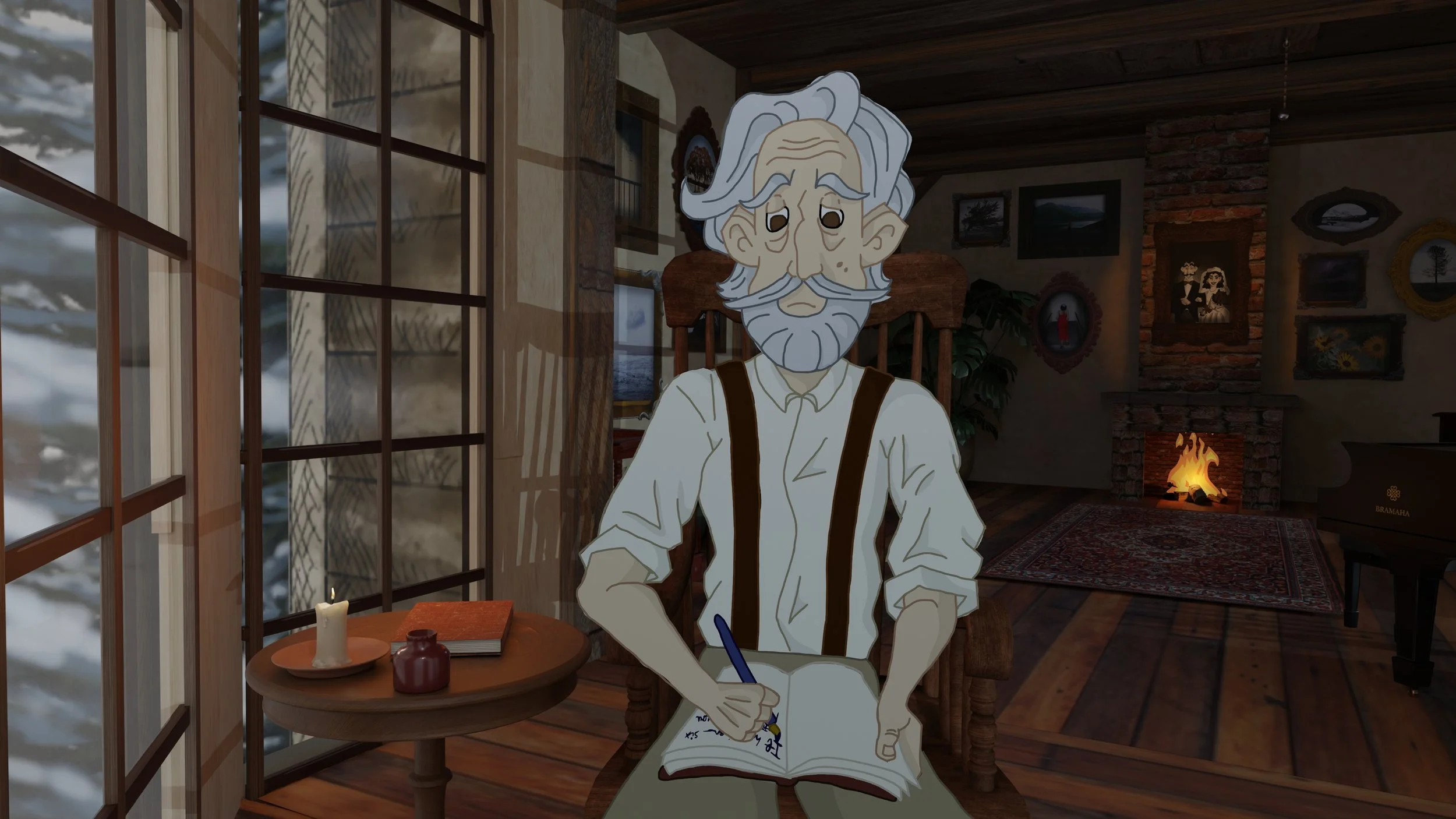
Animation Project:

Winter ballad

"It has been six months since you passed away. . .
And I still dance with you
Every day"

1.5 years in a timeline

Whether it is for myself, or for a fun project including my friends, I like to

experiment with everything

a challenge turned crazy

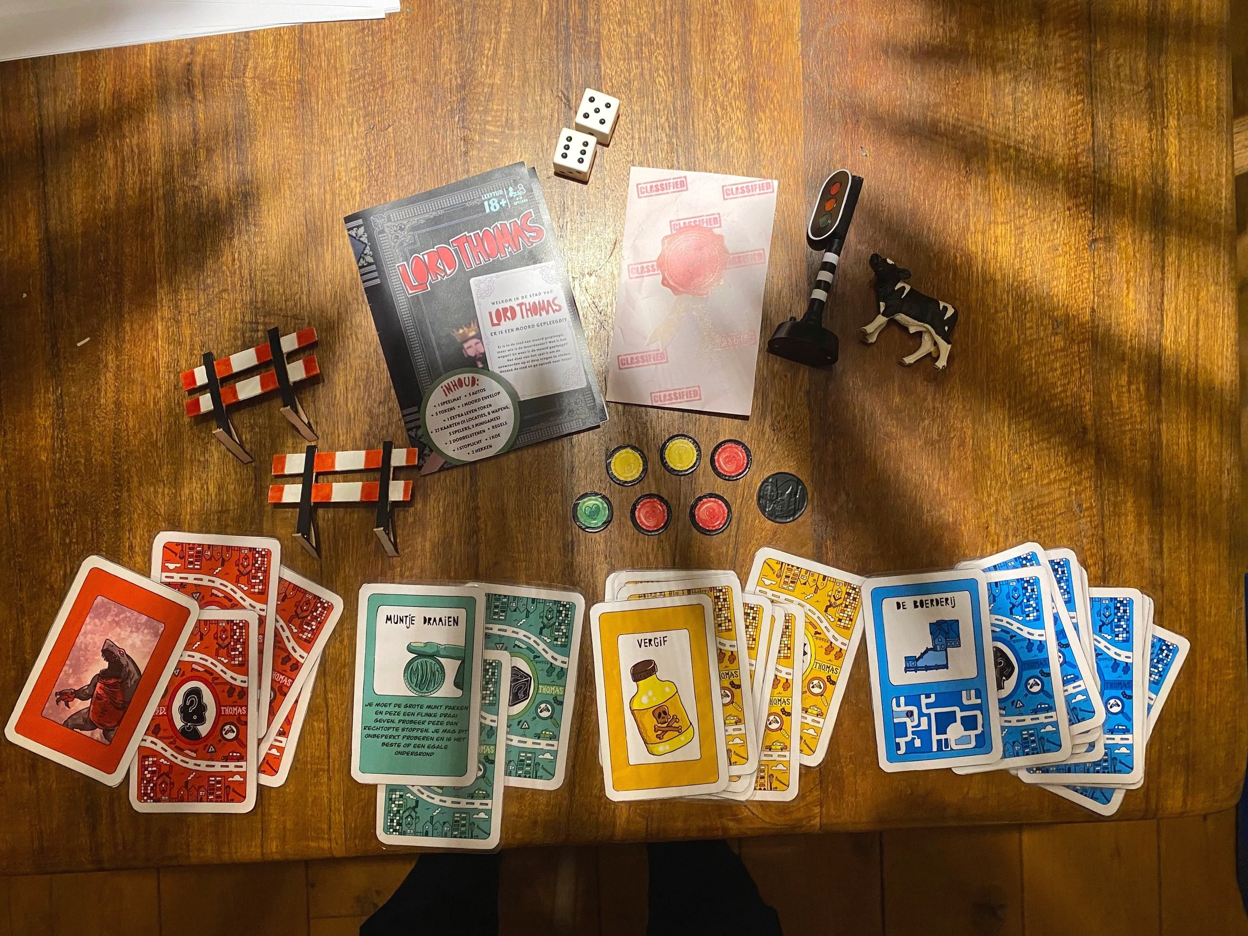
For my friends birthday, I bought him this playmat and a few hotwheel cars. I thought it was a funny thing to give a 24 year old. But then someone told me:
"You guys will never play with it"

So that's when I was challenged, from that point on I had to make sure I thought of a game so that we could play on this mat. This turned out to be way more work then I expected. I had to design: 27 cards, a rule book, and all other assets

It ended up being a Cluedo type of game, where the killer had to hinder traffic to keep other people from finding out he/she did it.